
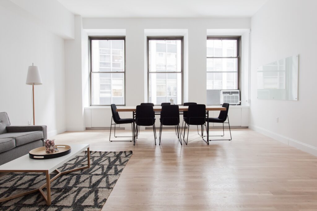
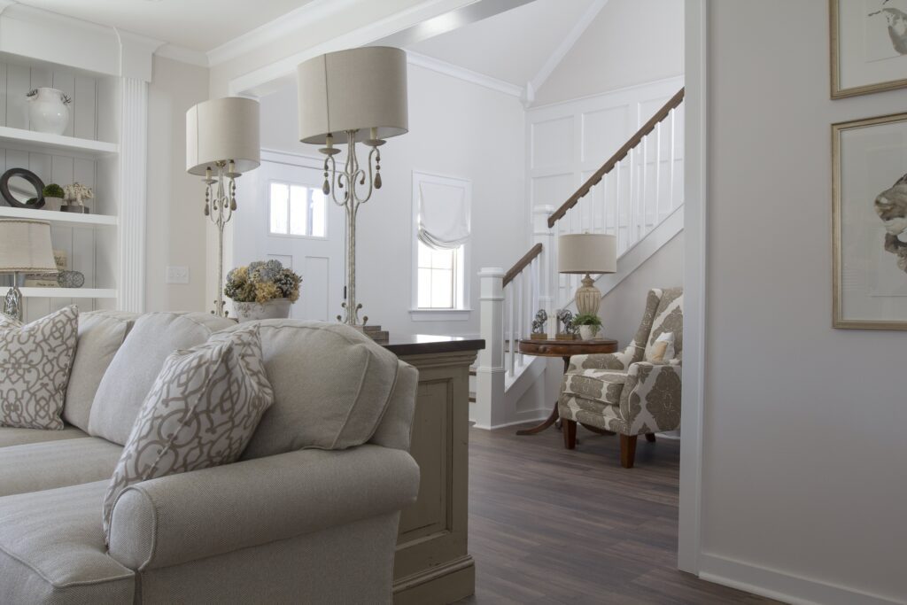
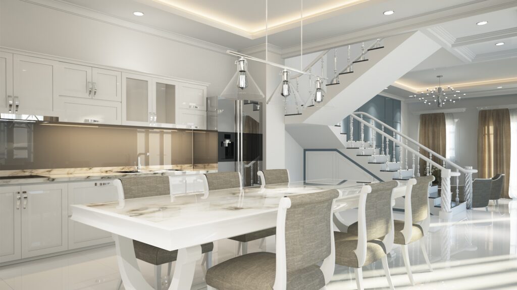
Never Choose Just White for Interiors
After working for a paint company for two and half years, I became very familiar with white. So many times I could hear painter’s clients say “I’ll just have white for the walls”. Do you know how many variations of white there are? Neither do I, but it must be hundreds.
When I first started on the job I worked for a day in the paint store mixing paint for painters to get an understanding of how color was created using a tinting machine. As a designer, I thought I was an expert on color and had a good understanding of how it was put together. But as I always say, you never know everything, you are always learning as an interior designer. So I learned about the different base colors that were required to make darker colors. This varied between the different types of paint, some colors were not possible in some types of paint or some gloss levels. It was a lot to learn but it gave me a very good insight into white.
Never Choose Just White for Interiors – You may not be happy with what you get – always be specific.
Every paint company will have a couple of white colors that painters hate to use, have you ever wondered why? It’s because they don’t cover well and they often have to do another coat, this costs them time and money. So they always try and talk their clients out of these particular whites. The reason for this is usually because they hardly have any tint in them. The tint provides the white based paint with color, the more tint the darker the white providing better coverage. However like anything there is always an exception, yellow tint, for some reason a yellow white still has problems with coverage.
The next thing about white is that when you use it inside the color intensifies. I had an experience where I had to go and confirm that the painter had indeed painted the interior walls in the correct color, white of course, but it a blue tint. The client had had plenty of time before painting to check the color swatches and confirm that it was the correct color. She was happy. Once it was painted, she was not. She absolutely hated it. The blue tint in the white had intensified as it was used on every wall and she had blue grey carpet. This made the blue look even stronger. Every room looked like it was a different color depending on how much natural light was in the room. The hallway looked very different to the kitchen, the bedrooms were pretty intense, and the toilet really looked purple. I took a paint swatch with me and held it up against all the walls in the different rooms – it looked correct. I had a small hand held machine that would read the color on the wall and match it to the closet color from our paint range of colors. It chose the color that was specified. I then went and checked the paint buckets, yes it was our paint that was used. I checked the formula, yes it was correct, and in the paint store once the paint has been tinted they always put a dab of the paint color on the top of the tin so the painter can test if it is the correct color before they start painting. Unfortunately for the owner of the home. Everything was correct. The moral of this story is to really understand what tinters are in your white. Just give the paint store a call and they will let you know. It only takes a few minutes.
A quick rule of thumb – for interiors, chose a shade lighter than you really want as inside it will look more intense/stronger. For exteriors, chose a shade darker as the UV light will wash out the color by a small amount and you will lose a bit of intensity.
I have another example – this one was sorted before the house was painted. I had a client who was a red head, she wanted just white walls once again, but with no red, orange or yellow tint. She had had white in her last home and every night when the sun set, all her walls looked pink and she loathed it. So we found a white that did not have any of the red, yellow or ochre in it. Then, when it was painted it looked very “bright” white as the light was reflecting off it as the house had a lot of large expanses of very high walls and windows. The floor had cardboard protecting the marble floors. Once the protective film was taken off the windows and the cardboard off the floor, the white marble with grey and brown veins toned down the white and it looked just right.
White is really difficult to perfect, but if you always think about where you are putting it, what will be next to it, what sort of light you get in the room and what tint goes into the formula to make the color white you have chosen, then you should be pretty confident that you have chosen well.
I didn’t go into what type of lighting is used in the house as this can also change the way white looks on the walls for interiors. Next time maybe.
I hope this gives you a better understanding of white, make sure you always chose it yourself, never leave it up to the painter to chose a white for you. No disrespect to painters, but you need to be in control of the white you get.

If you love learning about color and want to earn extra cash why not create a side hustle with color?